 Sometimes the headline says it all: “Why did the chicken lose its penis?”
(This is one where you really need to read the comments)

🎭 Theatre Writeups, 🛣️ Highway Updates, 📰 Musings on the News, and other 🗯️ Rants and Roadkill Along the Information Superhighway

Sometimes the headline says it all: “Why did the chicken lose its penis?”
(This is one where you really need to read the comments)
 If you’ve been reading my journal for a while, you know there are a number of recurrent themes that catch my interest. Theatre, of course, is just one of them (just booked the rest of June, for example). Words is another. Food. Los Angeles. Politics. … and of course, History. The last one is the unifying theme for this collection of links:
 Today brings yet another installment of news chum related to food, or should that be chews num felated to rood?
Music: Blast: An Explosive Musical Celebration (2000 Original Broadway Cast): “Split Complimentaries”
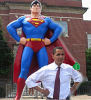 Today’s post brings together three articles, all loosely connected regarding the hazards of fame:
Music: Welcome to the Club (1989 Original Broadway Cast): “Southern Comfort”
 I’ve loved words ever since I was at UCLA and took Linguistics 10, which looked at the origins of words. So today’s news chum concerns words, in various forms… and shapes…
Music: Welcome to the Club (1989 Original Broadway Cast): “The Trouble with You”
 Today’s news chum brings you three articles all related to media and music, in some form:
 The unifying theme for today’s lunchtime news chum is enumeration: these are all lists of things. Further, they are all lists of things with which I have some disagreement:
 A big word in design circles these days is Skeuomorphism. Those who design interfaces are gnashing teeth and bemoaning the skeuomorphism in today’s interfaces, and newer interfaces are supposedly going to eschew it entirely. What is skeuomorphism? According to Wikipedia, it is when “a physical ornament or design on an object made to resemble another material or technique.” In other words, it is when an application used to delete files looks like a trashcan, an icon indicating saving files looks like a floppy disk, directories look like folders, email looks like envelopes, and (in general) thinks look like their archaic real world equivalents. Apple is supposedly going to a flat design and dropping skeuomorphic icons in the next version of iOS, and Windows has already started to do it in the flat design of Windows 8.
What got me thinking about skeuomorphism was a segment of this week’s Science Friday that we listened to on the drive home. This segment talked about helping seniors to tackle new technology. It talked about how seniors could be introduced to use the iPad and the iPhone, how to teach them to use computers, how they can be set in their habits… and how one can teach new technology by relating it to older things they know.
Yup. You can put 2 and 2 together as well as I can. The move away from skeuomorphism could be an attempt to get seniors — or at least less adaptable seniors — off the new technology. If you are dealing with a senior who can’t even figure out the power button, delete files, or do any simple tasks… now try imagine explaining it when the icon to do the task is something they don’t recognize.
So what are your thoughts? Is moving away from skeuomorphic design a good idea or a bad idea? What will be its impact on seniors?
