
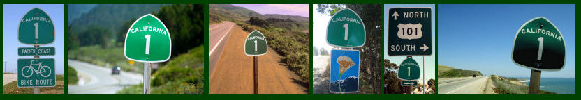
Those who used to travel in misc.transport.road circles know well the fights that road afficianados get into over their BGS. There was a large debate when button copy was supplanted by reflectorized signs. There is always a large debate about California never washing their older signs. The latest debate is over something called “Clearview”.
“Clearview”, for those not in the road scholar world, is an emerging font being used to replace Highway Gothic on most road signs. It is believed to be easier to read, although some feel it is fugly. The New York Times has an excellent article today about Clearview, how it came about, and its supposed advantage. Well worth the reading if you are into either fonts or roads.
